Campus Operations Analytics Dashboard
Temple University — FP&A BI Implementation
60%
Reporting time saved
3
Dashboard pages
4+
Semesters analyzed
Power BI
Primary tool
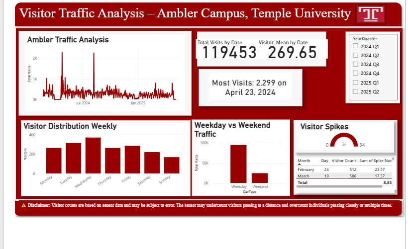
Problem
Campus leadership relied on manual spreadsheet-based reporting to track visitor traffic and allocate budgets — a process that was slow, error-prone, and lacked the real-time insights needed for effective resource planning. This mirrors the challenge FP&A teams face when transitioning from static Excel reports to dynamic BI solutions.
Approach
Applied FP&A best practices to an operational context: identified key performance indicators (KPIs), designed a star-schema data model in Power Query, built DAX measures for variance analysis, and created interactive dashboards with drill-down capabilities from summary to detail views.
Validation
Dashboard results were cross-checked against the source spreadsheets before go-live. DAX measures for YoY growth rates and rolling averages were validated against manually computed values. Campus operations staff reviewed the final output for accuracy before handoff.
Output
Delivered a self-service analytics platform that replaced manual reporting workflows. Campus leadership now has real-time visibility into traffic patterns, can identify underutilized time slots for resource reallocation, and makes budget decisions backed by quantitative evidence. Reduced manual reporting time by 60%.
Limitations
The dashboard draws from historical operational data; predictive modeling is not included in the current version. Data quality depends on accurate input from campus scheduling systems. Cross-campus benchmarking is not available in this implementation.
Next Improvements
Adding a forecasting layer using Power BI's built-in time series analysis for proactive capacity planning. Integrating budget actuals vs. plan tracking to extend the tool into a full FP&A reporting platform. Building a mobile-optimized executive summary page.